How to Build Ecommerce Navigation That Actually Drives Sales
Menus, Flyouts, and How Shoppers Really Use Them
Navigation is one of the most important parts of an ecommerce site, and one of the most misunderstood.
Many brands treat menus as a design requirement or a place to “list everything we sell.” But shoppers don’t use navigation like a sitemap. They use it as a shortcut. A decision tool. A way to get closer to what they want as quickly as possible.
At Your eCommerce Team, we see navigation as a sales asset. When it’s structured well, it guides shoppers to the right collections faster, increases engagement, and quietly improves conversion rates. When it’s cluttered or confusing, it creates friction before a product page is ever seen.
Here’s how shoppers actually use menus and how to build navigation that works with their behavior.
How Shoppers Really Use Menus (Not How Brands Expect Them To)
Most shoppers don’t open a menu to explore every option. They scan. They skim. They look for familiar words or shortcuts that confirm they’re in the right place.
In practice, shoppers usually fall into one of three modes:
“I know what I want” — They’re looking for a specific category or product type.
“Show me options” — They want to browse, but only within a clear framework.
“Help me decide” — They’re looking for bestsellers, collections, or guidance.
What they’re not doing is reading every menu label carefully or clicking through five levels of navigation to understand your catalog.
That’s why menus need to be intuitive at a glance. The job of navigation is to help shoppers self-select the fastest path forward.
Common Flyout and Mega Menu Mistakes We See
When navigation underperforms, it’s rarely because a store doesn’t have enough links. More often, it’s because there are too many.
Let’s say you run a lifestyle brand with 30 collections. If every single collection appears in your main flyout, shoppers are forced to slow down and figure out what matters.
Some of the most common issues we see:
Every collection treated as equally important
Too many links competing in the same space
No visual or logical hierarchy
Category names that make sense internally but not to shoppers
Repeated links across multiple menu levels
When everything is featured, nothing stands out. Shoppers hesitate. Or worse, they leave. Good navigation removes unnecessary choices instead of adding more.
Why Naming and Hierarchy Matter More Than Design
You can have a beautifully designed mega menu that still underperforms if the structure underneath it isn’t clear.
Imagine a brand that labels a key category as “The Edit.” Internally, that may make sense. But to a new shopper, it’s vague. Is it new arrivals? Bestsellers? A seasonal feature?
Strong navigation relies on clear, descriptive naming that removes guesswork. Good category names tell shoppers exactly what they’ll find before they click.
Effective menu naming usually does one of the following:
Clearly describes the product type (e.g., Women’s Dresses, Men’s Boots)
Signals intent or popularity (e.g., Best Sellers, New Arrivals)
Reflects how shoppers think and search (e.g., Workwear, Party Supplies, Gifts Under $50)
Hierarchy reinforces that clarity. Items placed higher in a menu naturally feel more important, whether that’s intentional or not. When naming and hierarchy work together, shoppers spend less time decoding labels and more time moving toward products.
Desktop vs Mobile Navigation: Same Goal, Different Rules
Desktop and mobile navigation serve the same purpose, but they can’t be treated the same way.
On desktop, shoppers may browse through flyouts, compare categories, and explore more freely. On mobile, speed matters more than depth.
Common mobile navigation mistakes we see include:
Hiding bestsellers several layers deep
Requiring excessive scrolling to see key categories
Reusing desktop menu structures without simplification
Nesting too many subcategories under a single label
Strong mobile navigation often means making harder choices. Fewer links. Clearer paths. Faster access to priority collections.
To see this in action, look at how Moment & Company structures its mobile navigation. Instead of overwhelming shoppers with dozens of links at once, the menu surfaces a small number of clear, high-level categories, making it easier to browse quickly on a smaller screen.
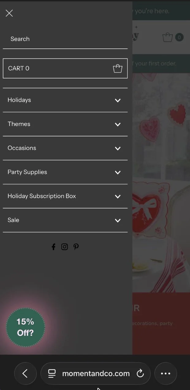
Example of streamlined mobile navigation in Moment & Co’s online shop
How to Prioritize Bestsellers and Revenue-Driving Collections
One of the biggest missed opportunities in ecommerce navigation is failing to prioritize what actually sells.
Let’s say your “Best Sellers” collection drives 40% of revenue, but it’s buried under a generic “Shop” menu. That’s a disconnect.
Your top navigation should reflect your business goals. That often means highlighting:
Bestselling collections
High-margin categories
Seasonal or promotional groupings
Clear entry points for new shoppers
When we optimize menus, we use real data like sales performance, search behavior, and collection engagement to decide what earns top placement and what can move lower.
Clean vs Cluttered Navigation: What the Difference Looks Like
Clean navigation doesn’t mean minimal for the sake of design. It means intentional choices that make shopping easier.
One of the simplest ways to spot the difference is to look at how cluttered and clean navigation behave side by side. When menus are overloaded, shoppers hesitate. When they’re structured with purpose, shoppers move forward with confidence. The contrast is subtle, but it has a real impact on how a store performs.
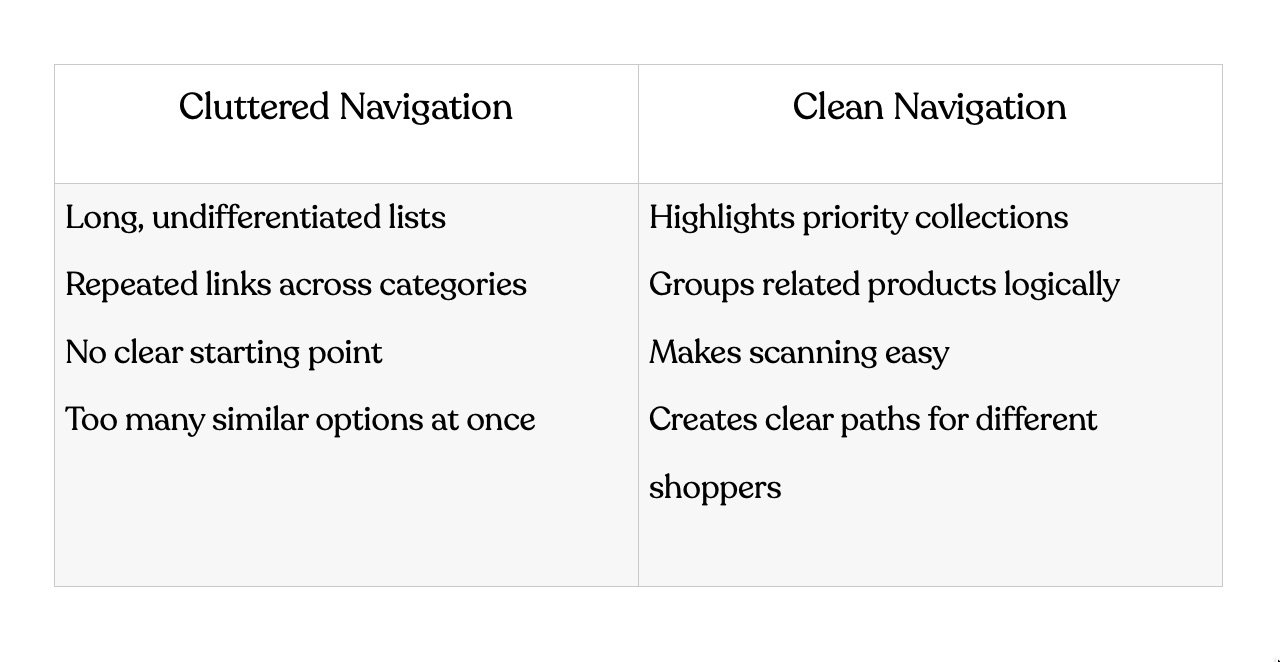
The difference is subtle but powerful. Small changes to menus often unlock meaningful improvements in engagement and conversion, without touching product pages at all.
How Your eCommerce Team Optimizes Navigation for Growth
For us, navigation is part of a larger growth strategy.
When Your eCommerce Team works on menus and flyouts, we start with behavior and performance. We look at how shoppers move through the site, which collections drive revenue, and where friction appears.
Here’s how we typically approach navigation optimization:
Audit existing navigation and collection performance
We start by understanding how shoppers actually interact with the menu today and which collections drive traffic and revenue.Identify priority categories using real data
We look at sales performance, engagement, and search behavior to determine what deserves top placement.Rebuild hierarchy with conversion in mind
We restructure menus to guide shoppers toward high-value collections faster, without overwhelming them.Optimize for both desktop and mobile behavior
We ensure navigation feels intuitive across devices, accounting for how browsing behavior changes on smaller screens.Align navigation with merchandising and SEO efforts
We make sure the menu structure supports ongoing promotions, collection strategy, and long-term search visibility.
Navigation optimization often sits alongside our Shopify website design and conversion-focused strategy work. It’s one of the fastest ways to make a store feel easier to shop, without adding more traffic.
Navigation Should Sell, Not Just Sort
Great ecommerce navigation works quietly in the background, guiding shoppers exactly where they want to go.
When menus are built around real shopper behavior and business priorities, the entire site feels easier to use. Products get discovered faster. Collections perform better. Conversion improves naturally.
If your navigation feels cluttered or disconnected from performance, it may be time to step back and look at the structure behind it. At Your eCommerce Team, we help brands evaluate how their menus, collections, and site hierarchy support (or hinder) growth.
Explore our Shopify website design & SEO services to see how we approach site structure, UX, and performance together.